
Open Source DOM Component
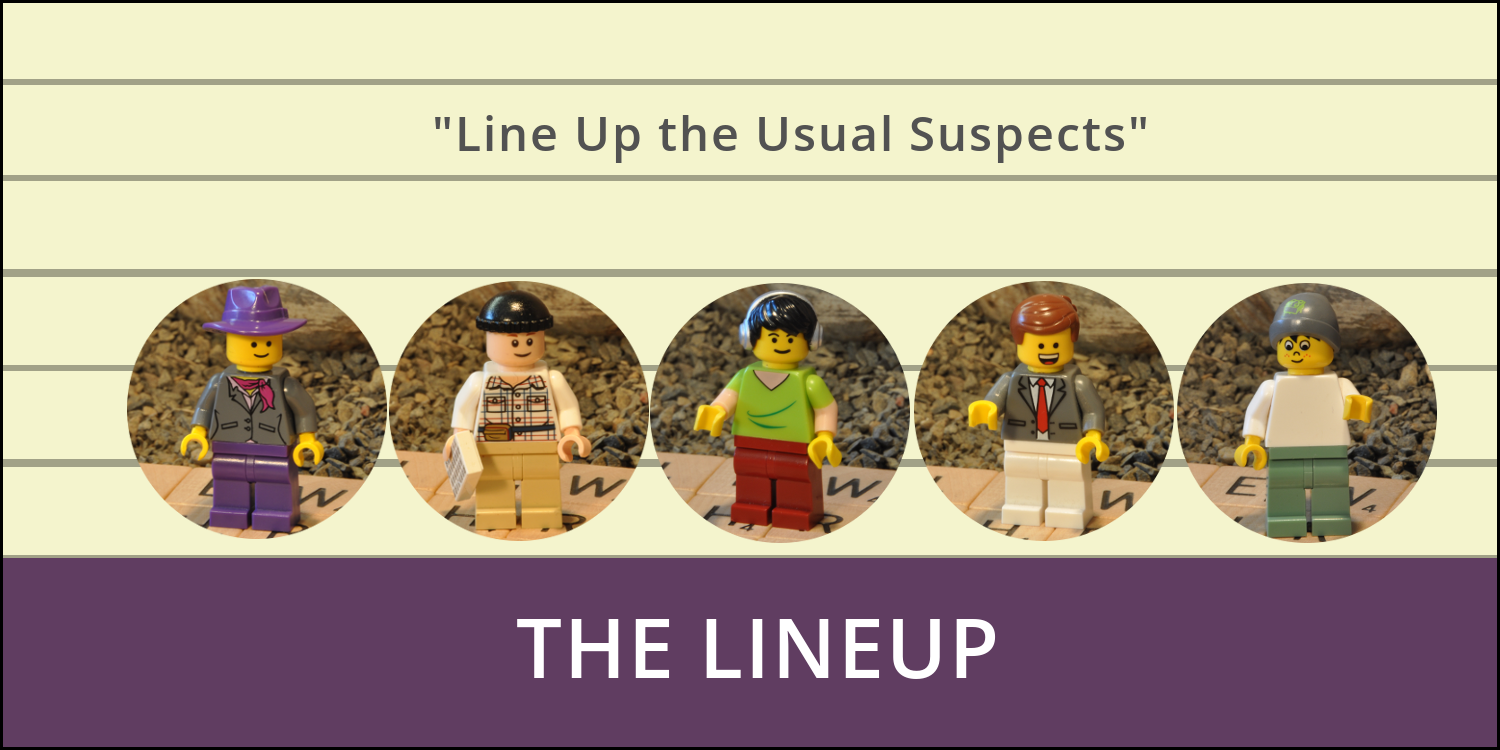
The Lineup
All the usual suspects
 by Read Write Tools
| Abstract |
|---|
| The rwt-lineup DOM component is a flexible menu using round images as hyperlinks, with a pullbar to expand items that have overflowed its single-line container. |
Motivation
Sometimes a visual menu is better than a textual menu.
The rwt-lineup DOM component applies circular styling to square images, providing a fully iconic interface. For situations where there are too many hyperlinks to fit in a single line, the extras are kept hidden until activated by the user, using either the visual pullbar or the component's toggleMenu method or through its event interface.
This component is a light-hearted take on "The Line Up" of "all the usual suspects". It's designed for use in a website's top banner area.
The component has these features:
- A single line of icons is displayed in the container's collapsed state. The full set of icons is display in the expanded state, accommodating any number of menu items.
- The menu item corresponding to the current page is highlighted and scrolled into view when the page is loaded.
- The menu has an event interface for expanding and collapsing itself.
- The menu emits a custom event to close sibling menus and dialog boxes.
- Menu items may be kept separate from the DOM component, allowing the webmaster to change its contents in a single centralized place. Alternatively, menu items may be slotted directly between the component's opening and closing tags.
- A keyboard listener is provided to allow a shortcut key to expand/collapse the menu.
- A half-height pullbar for expanding the container is displayed along the bottom margin, appearing larger on hover.
- The first few times that a visitor interacts with your website, the pullbar pulses to draw attention to itself.
In the wild
To see an example of this component in use, visit the DOPPELMARKS website. It uses this component at the top of the page. To understand what's going on under the hood, use the browser's inspector to view the HTML source code and network activity, and follow along as you read this documentation.
Installation
Prerequisites
The rwt-lineup DOM component works in any browser that supports modern W3C standards. Templates are written using BLUEPHRASE notation, which can be compiled into HTML using the free Read Write View desktop app. It has no other prerequisites. Distribution and installation are done with either NPM or via Github.
Download
Download using NPM
OPTION 1: Familiar with Node.js and the package.json file?
Great. Install the component with this command:
npm install rwt-lineup
OPTION 2: No prior experience using NPM?
Just follow these general steps:
- Install Node.js/NPM on your development computer.
- Create a
package.jsonfile in the root of your web project using the command:
npm init
npm install rwt-lineup
Important note: This DOM component uses Node.js and NPM and package.json as a convenient distribution and installation mechanism. The DOM component itself does not need them.
Download using Github
If you prefer using Github directly, simply follow these steps:
- Create a
node_modulesdirectory in the root of your web project. - Clone the rwt-lineup DOM component into it using the command:
git clone https://github.com/readwritetools/rwt-lineup.git
Using the DOM component
After installation, you need to add two things to your HTML page to make use of it.
- Add a
scripttag to load the component'srwt-lineup.jsfile:
<script src='/node_modules/rwt-lineup/rwt-lineup.js' type=module></script>
- For scripting purposes, apply an
idattribute. - Apply a
sourcerefattribute with a reference to an HTML file containing the menu's hyperlinks. - Optionally, apply a
shortcutattribute with something likeF9,F10, etc. for hotkey access. - For WAI-ARIA accessibility apply a
role=navigationattribute. - For simple menus, the
sourcerefmay be omitted and the menu hyperlinks may be slotted into the DOM component. Simply place the hyperlinks directly between the<rwt-lineup>and</rwt-lineup>tags. - Here's an example HTML tag where the menu items are in a separate file:
<rwt-lineup id=lineup sourceref='/menu.html' shortcut=F10 role=navigation></rwt-lineup>
Menu template
The content and format of the menu items should follow this pattern, which uses anchors <a> that enclose images <img>.
<a href='/path/to/page1.html' tabindex=301 <img src='/img/page1.jpg' title='Page 1' ></a>
<a href='/path/to/page2.html' tabindex=301 <img src='/img/page2.jpg' title='Page 2' ></a>
<a href='/path/to/page3.html' tabindex=301 <img src='/img/page3.jpg' title='Page 3' ></a>
Self identification
The menu item corresponding to the current page can be highlighted when it identifies itself to the menu. This is accomplished by adding a meta tag to the page that contains the short-form URL of the page itself. For example, if the page's full URL is https://example.com:443/services.html the shortform URL would be /services.html.
The short-form URL should be added to a special-purpose meta tag, like this:
<meta name='lineup:this-url' content='/services.html' />
Customization
Menu item size and spacing
The images that you provide should be square. They will be resized using the value you specify with the CSS --img-size variable. Spacing between the icons can be adjusted with the --img-margin variable.
The height of the pullbar can be made more or less prominent by setting the --pullbar-height variable.
The --width variable can be used to shorten the width of the component's inner container.
rwt-lineup {
    --img-size: 64px;
    --img-margin: 16px;
    --width: 100%;
    --pullbar-height: 1rem;
}
Menu color scheme
The default color palette for the menu uses a dark mode theme. You can use CSS to override the variables' defaults:
rwt-lineup {
    --color: var(--pure-white);
    --accent-color1: var(--title-blue);
    --accent-color2: var(--yellow);
    --accent-color3: var(--dark-gray);
    --background: var(--transparent-black);
    --accent-background1: var(--light-black);
    --accent-background2: var(--pure-black);
}
Life-cycle events
The component issues life-cycle events.
component-loaded- Sent when the component is fully loaded and ready to be used. As a convenience you can use the
waitOnLoading()method which returns a promise that resolves when thecomponent-loadedevent is received. Call this asynchronously withawait.
Event controllers
The menu can be controlled with its event interface.
toggle-lineup- The component listens on DOM
documentfortoggle-lineupmessages. Upon receipt it will expand or collapse the lineup. keydown- The component listens on DOM
documentforkeydownmessages. If the user presses the configured shortcut key (F9, F10, etc) it will collapse/expand the menu. The Esc key collapses the menu. collapse-popup- The component listens on DOM
documentforcollapse-popupmessages, which are sent by sibling menus or dialog boxes. Upon receipt it will collapse itself. click- The component listens on DOM
documentforclickmessages. When the user clicks anywhere outside the menu, it collapses itself.
Reference
 | Documentation | READ WRITE HUB |
 | Source code | github |
 | Component catalog | DOM COMPONENTS |
 | Package installation | npm |
 | Publication venue | READ WRITE STACK |
License
The rwt-lineup DOM component is licensed under the MIT License.

MIT License
Copyright © 2023 Read Write Tools.
Permission is hereby granted, free of charge, to any person obtaining a copy of this software and associated documentation files (the "Software"), to deal in the Software without restriction, including without limitation the rights to use, copy, modify, merge, publish, distribute, sublicense, and/or sell copies of the Software, and to permit persons to whom the Software is furnished to do so, subject to the following conditions:
The above copyright notice and this permission notice shall be included in all copies or substantial portions of the Software.
THE SOFTWARE IS PROVIDED "AS IS", WITHOUT WARRANTY OF ANY KIND, EXPRESS OR IMPLIED, INCLUDING BUT NOT LIMITED TO THE WARRANTIES OF MERCHANTABILITY, FITNESS FOR A PARTICULAR PURPOSE AND NONINFRINGEMENT. IN NO EVENT SHALL THE AUTHORS OR COPYRIGHT HOLDERS BE LIABLE FOR ANY CLAIM, DAMAGES OR OTHER LIABILITY, WHETHER IN AN ACTION OF CONTRACT, TORT OR OTHERWISE, ARISING FROM, OUT OF OR IN CONNECTION WITH THE SOFTWARE OR THE USE OR OTHER DEALINGS IN THE SOFTWARE.


